
In UX For Beginners: A Crash Course in 100 Short Lessons, Joel Marsh sums up the goal of a landing page as showing users where to go and providing answers to the following three questions as being key to achieving that:
- What is this?
- What’s in it for me?
- What do I do next?
When crafting my own landing page to test an idea, I used Marsh’s questions as a framework to structure the information. The only addition that I made was to incorporate a unique value proposition to the first question (What is this and what is special about it?). For those interested in the mechanics of design, I used Figma to create an initial mock before building the page. I’m aware that there are no-code alternatives like Webflow etc, but my design was simple enough for me to write the code myself and it didn’t take me too much time to have it in place. The icons that you see are from Icons8 and they are available free of charge (Figma enabled me to combine and adapt them to my own needs). I remember spending some time playing around with the colours but I finally went with what felt right (some of it was based on the icon designer’s colour palette).
The effectiveness of a landing page ultimately boils down to its conversion rate. I didn’t spend money on any Google or Facebook ads, but as outlined in this post, I targeted the right users through relevant Facebook groups. The conversation rate (sign-ups to views) was around 20% but this might have well been lower had I tried to test willingness-to-pay and quoted a product cost somewhere.
I’ve annotated my landing page to highlight some of the key takeaways. Reflecting on it now, I’d probably keep it problem-centric and avoid hinting at solutions (I’ve mentioned a gamified environment, for example).
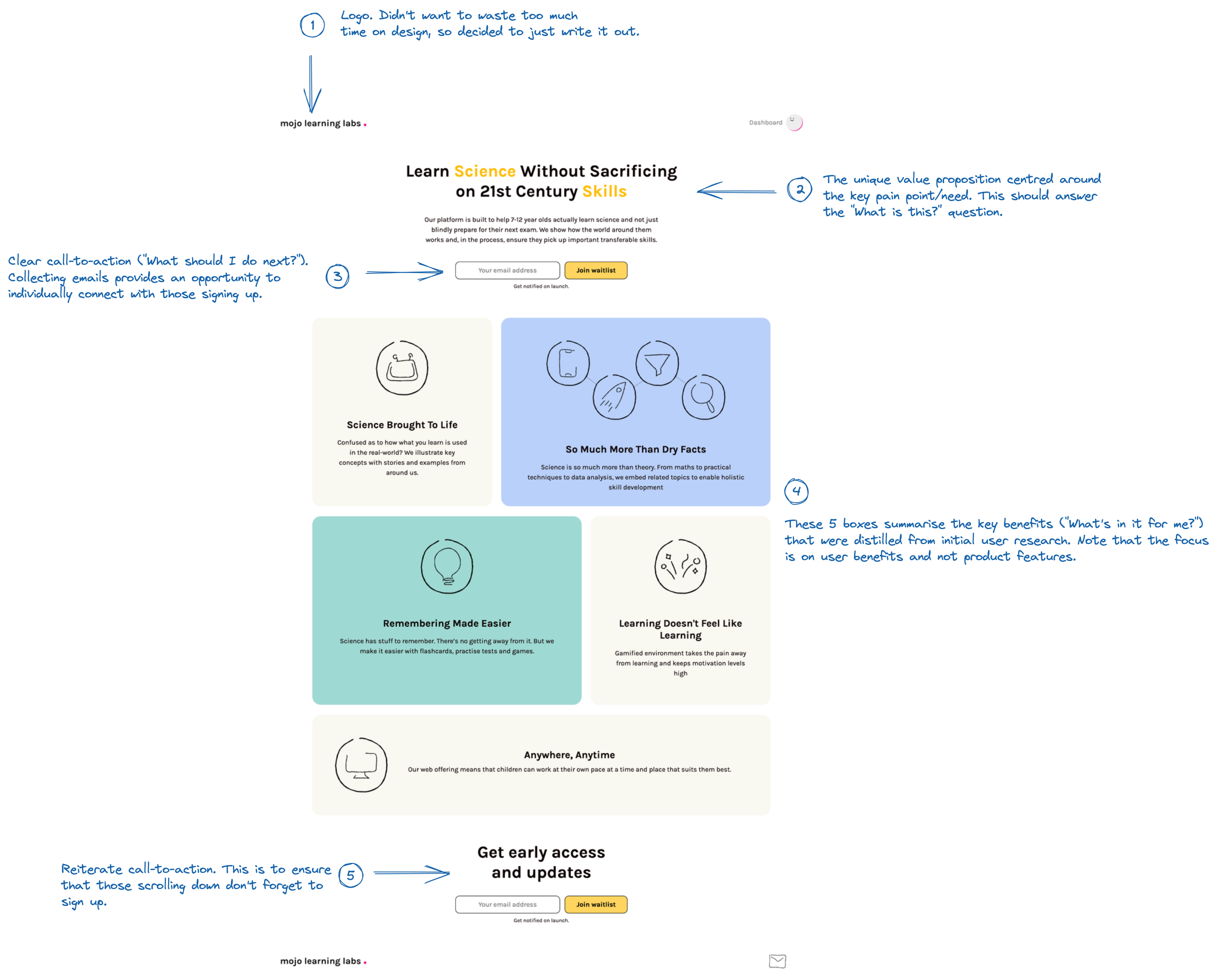 Landing page with annotations (click to enlarge)